
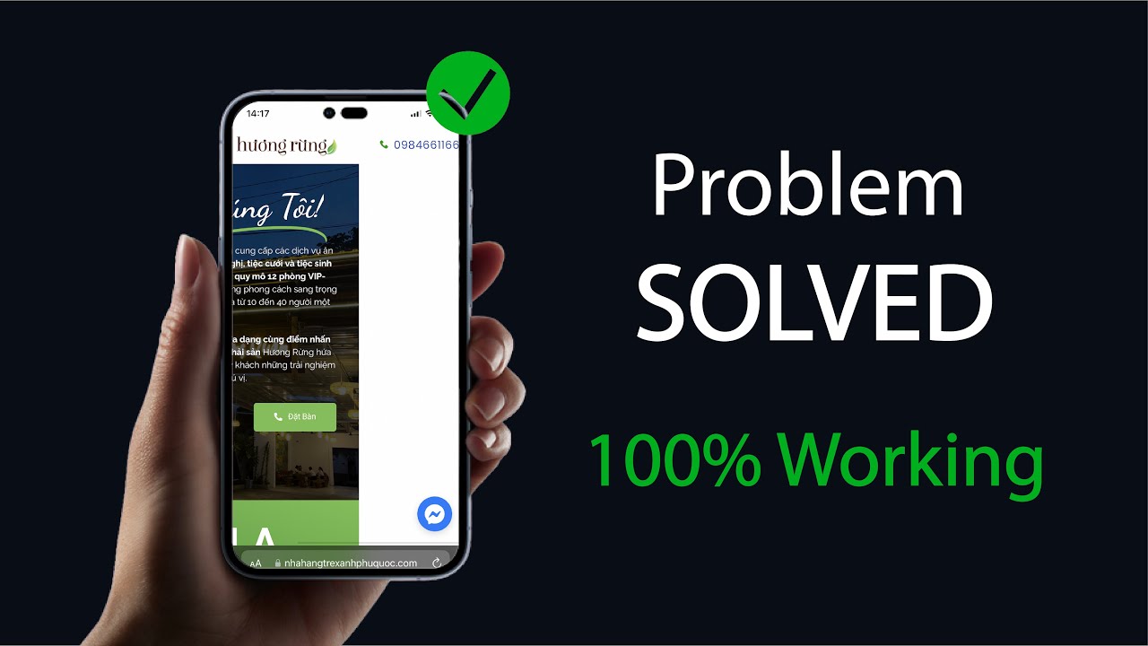
Have you ever launched your dream website with Elementor, only to realize it looks awkward or broken on mobile devices? If you’re struggling with how to fix mobile responsiveness issue in Elementor, you’re definitely not alone. These days, most traffic comes from smartphones, yet many WordPress users face frustrating responsiveness issues that can chase visitors away and even harm SEO rankings.
In this blog, we’ll walkthrough the exact steps you need to fix mobile responsiveness issues in Elementor. You’ll learn common pitfalls, pro tips, and practical solutions to make your site shine—no matter the screen size! Drawing insights from Elementor Academy, top YouTube creators, Reddit user experiences, and expert tutorials, this long-form guide will empower you to master responsiveness once and for all.

What is Mobile Responsiveness Issue in Elementor?
Mobile responsiveness refers to how gracefully your website adapts to different screen sizes—especially phones and tablets. When using a page builder like Elementor, the promise is that your design will look great everywhere. Yet, sometimes, you end up with layouts that “break,” buttons overlap, text shrinks too much, or elements simply vanish. This is what we call a “mobile responsiveness issue.”
In essence, Elementor responsiveness issues are mismatches between your desktop design and how it displays on mobile devices. If not handled, these issues frustrate users and eat into your traffic, engagement, and conversions.

Why Fixing Elementor Mobile Responsiveness Matters
Solving mobile responsiveness issues in Elementor isn’t just about looks—it’s the backbone of a high-performing, user-friendly website:
- Improved User Experience: Visitors enjoy seamless browsing on any device, reducing bounce rates and boosting trust.
- Better SEO Rankings: Google uses “mobile-first indexing”—if your site displays poorly on mobile, you risk lower search visibility.
- Higher Conversions: Responsive sites generate more leads, sales, and sign-ups since visitors can interact easily on their phones.
- Brand Credibility: Sleek mobile layouts reflect professionalism and attention to detail.
- Wider Reach: Cater to the 80%+ of users who surf predominantly on mobile devices.
If you delay addressing Elementor responsiveness issues, you miss out on all these benefits and potentially fall behind competitors.

Common Use Cases & Examples of Elementor Responsiveness Issues
It helps to recognize the most frequent mobile problems Elementor users encounter. Here are some real-world examples and use cases based on community experiences and support threads:
- Overlapping Columns: Two or more content columns squish together too tightly on small screens.
- Button/Link Clutter: Buttons become too small or overlap, making them hard to tap.
- Image Cut-off: Photos spill outside their containers, ruining alignment.
- Text Too Small/Large: Font sizes haven’t adjusted for mobile, making content unreadable.
- Hidden Elements: Sections disappear because display settings are misconfigured.
- Spacing/Padding Issues: Margins look good on desktop but feel awkward or non-existent on phones.
- Unoptimized Menus: Navigation isn’t touch-friendly or collapses incorrectly.
All these issues create a rough user experience. Luckily, Elementor offers robust mobile editing features and tools for troubleshooting—if you know where to look!
Step-By-Step Process: How to Fix Mobile Responsiveness Issue in Elementor
Ready to transform your site’s mobile experience? Here’s a proven, streamlined process to fix mobile responsiveness issues in Elementor (including must-try expert tricks).
1. Use Elementor’s Built-In Responsive Preview
Click the “Responsive Mode” icon (monitor/tablet/mobile) at the bottom of the Elementor editor. Preview your page as it appears on tablets and smartphones. Identify where elements break, overlap, or look odd.

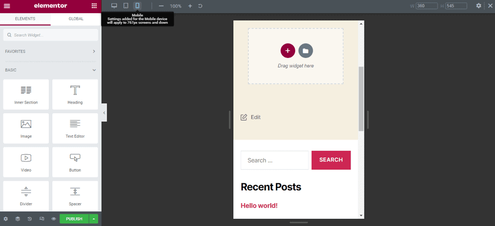
2. Customize for Each Device (Section, Column, Widget)
Elementor allows fine-tuning for each screen size:
- Select a section/column/widget.
- Look for the device icon next to style options (typography, padding, margin, alignment).
- Set separate values for desktop, tablet, and mobile—ensuring proper spacing and sizing.
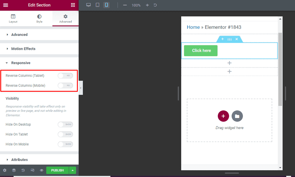
3. Control Visibility with Responsive Settings
Found an element that doesn’t belong on mobile (like a large image or table)? Right-click the widget or section, choose “Advanced” > “Responsive,” and toggle off “Hide on Mobile” as needed. This keeps content relevant and reduces clutter.
4. Adjust Padding and Margin for Smaller Screens
Extra space on desktop often equals tight or overflowing content on mobile. Always set responsive paddings/margins for rows, columns, and widgets. Use the “unlink values” option to tailor each side as needed.
5. Use Custom CSS (For Advanced Fixes)
If default controls aren’t enough, add custom CSS for mobile breakpoints. Example:
@media (max-width: 767px) {
  .your-element-class { padding: 10px 0; font-size: 1.1rem; }
}
Add this via Elementor’s “Custom CSS” (Pro version) or in your theme customizer for further responsiveness.
6. Check Theme Compatibility and Plugin Conflicts
Sometimes, your WordPress theme or third-party plugins override Elementor’s styling—causing unexpected responsiveness problems. Temporarily switch to an official Elementor-compatible theme (like Hello Theme) and disable plugins one-by-one to isolate conflicts.
7. Use Prebuilt Mobile-Friendly Templates
Elementor’s template library offers hundreds of mobile-optimized templates. Import one as a baseline, compare settings, and adapt best practices to your own designs.

8. Test on Real Devices
Simulators only go so far. Always test key pages on actual smartphones and tablets—especially Apple and Android devices. Borrow a friend’s or use free tools like BrowserStack for cross-device testing to spot hidden Elementor mobile issues.
9. Update Everything
Outdated plugins or themes often cause issues. Keep Elementor, your theme, and every plugin updated to ensure compatibility with the latest mobile standards.
10. Save, Clear Cache, and Re-Publish
After making changes, always:
- Save your work in Elementor
- Clear any caching plugins/services
- Revisit your site on a private/incognito window
This ensures you see the latest version and your fixes take effect.
Challenges, Myths, and Common Objections About Elementor Responsiveness Issues
While Elementor is a powerful builder, some myths and roadblocks prevent users from mastering mobile responsiveness:
- “Elementor is 100% responsive out of the box.”—Mostly, but depends on your customizations, theme, and content!
- “I fixed one widget. The whole page is now mobile-perfect.”—No, check every section and device type individually.
- “I don’t need to test on real phones.”—Simulators can overlook device-specific quirks; testing live is critical.
- “Only developers can solve these problems.”—Elementor’s UI puts nearly all tools in your hands. Most issues don’t require code.
- “Responsiveness doesn’t impact SEO.”—False! Google prioritizes mobile browsing and rewards sites that deliver an excellent mobile experience.
Overcome these myths by embracing a responsive workflow as part of every Elementor site build.
FAQs About How to Fix Mobile Responsiveness Issue in Elementor
1. Why is my Elementor page not responsive on mobile?
This can happen due to mismatched column widths, fixed pixel values, or conflicting theme styles. Use Elementor’s responsive editor and adjust settings for mobile, tablet, and desktop individually.
2. How do I fix overlapping columns in Elementor’s mobile view?
Select the offending section, reduce column width, or stack columns vertically on mobile. Adjust padding and margin per device, using the device icons beside each setting.
3. How can I hide certain widgets on mobile using Elementor?
Right-click the widget or section, go to Advanced > Responsive, and toggle on “Hide on Mobile.” This feature lets you show or hide content for specific devices.
4. Do I need Elementor Pro to fix responsiveness issues?
No! All essential responsive controls are available in the free version. Pro is only needed for advanced custom CSS or more intricate tweaks.
5. How can I test my Elementor site on different devices?
Use Elementor’s built-in preview, or try real-device testing via friends, BrowserStack, or Chrome Developer Tools mobile simulator.
6. What should I do if my responsive changes don’t show up?
Clear all site and browser caches, and make sure to hit “Update” in Elementor. Disable any caching plugins temporarily to test changes live.
7. My theme is breaking Elementor’s responsiveness. What now?
Switch to a basic, Elementor-compatible theme like Hello or Astra. If the issue resolves, your original theme is likely the culprit.
8. Can custom CSS help with responsive Elementor fixes?
Absolutely! For unique layouts, add @media queries in Elementor Pro’s Custom CSS tab or your site’s stylesheet to refine mobile appearance.
9. Why does my menu look strange on mobile in Elementor?
You might need to switch to a dedicated “Nav Menu” widget and style it for mobile. Check hamburger menu settings and spacing within Elementor.
10. Does mobile responsiveness affect website speed in Elementor?
Yes, poorly optimized mobile layouts can increase DOM size and load times. A clean, leans responsive design ensures better speed and user experience.
Conclusion: Take Control of Your Elementor Responsiveness Issues
Now you know exactly how to fix mobile responsiveness issue in Elementor, backed by expert advice and community insights. With Elementor’s robust responsive editing tools, mobile-friendly templates, and troubleshooting tactics, it’s never been easier to build layouts that look flawless everywhere.
Don’t let frustrating mobile issues hold back your website’s UX or SEO. Take the time to preview, tweak, and test on multiple devices so every user enjoys your content—no matter where or how they browse. If you’re feeling stuck, revisit this checklist or explore Elementor’s tutorials for further help.
Ready to boost your site’s mobile performance? Dive in, get tweaking, and build websites that wow visitors on every screen size.
For more WordPress and Elementor guides, follow our blog at Digital With Sandip. Happy building!